- Packages I will use to read and plot the Data
- Read the Data in from part 1
Interactive Graph
Start with the data
Group_by country so there will be a “river” for each country
Use mutate to round Tons so only 2 digits will be displayed when you hover over it.
Use mutate to change Year so it will be displayed as end of year instead of beginning of year
Use e_charts to create an e_charts object with Year on the x axis
Use e_river to build “rivers” that contain tons by country
The depth of each river represents the amount of apples for each country
Use e_tooltip to add a tooltip that will display based on the axis values
Use e_title to add a title, subtitle, and link to subtitle
Use e_theme to change the theme to roma
apple   %>%
  group_by(Country)  %>%
  mutate(Tons = round(Tons, 2),
         Year = paste(Year, "12", "31", sep="-"))  %>%
  e_charts(x = Year)   %>%
  e_river(serie = Tons, legend=FALSE)  %>%
  e_tooltip(trigger = "axis")  %>%
  e_title(text = "Annual amount of apples, by Country",
          subtext = "(in Tons). Source: Our World in Data",
          sublink = "https://ourworldindata.org/grapher/apple-production?",
          left = "center")  %>%
  e_theme("roma")
Static Graph
Start with the data
Use ggplot to create a new ggplot object. Use aes to indicate that Year will be mapped to the x axis; amount of apples will be mapped to the y axis; country will be the fill variable
geom_area will display tons
scale_fill_discrete_divergingx is a function in the colorspace package. It sets the color palette to roma and selects a maximum of 12 colors for the different regions
theme_classic sets the theme
theme(legend.position = “bottom”) puts the legend at the bottom of the plot labs sets the y axis label, fill = NULL indicates that the fill variable will not have the labelled Region
apple %>%
  ggplot(aes(x = Year, y = Tons,
             fill = Country)) +
  geom_area() +
  colorspace::scale_fill_discrete_divergingx(palette = "roma", nmax =11) +
  theme_classic() +
  theme(legend.position = "bottom") +
  labs( y = "In Tons",
       fill = NULL)
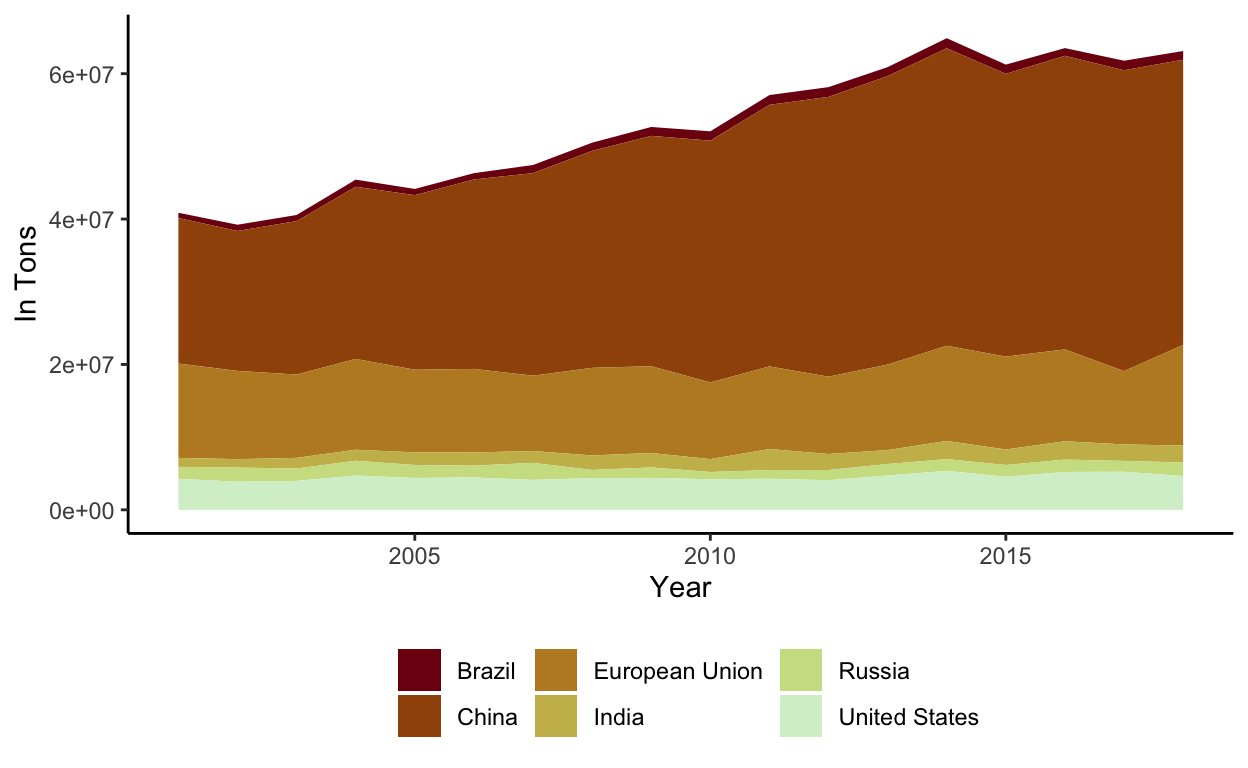
Both of these Plots show a slight but steady increase in apple production from 2001 to 2018